Home Assistant - an unofficial redesign
October 2023For this study I redesigned the home page for Home Assistant.
My goal was to improve product clarity —what is it, who is it for— as well as improve the visual design and hierarchy to reduce cognitive load.
The website stood out as a particularly good problem to solve, as I personally found it overwhelming, cluttered and lacking a clear direction. However, I don't want to undermine the fantastic work they do on their free product.
This study was a short, time-boxed weekend project to kick start my portfolio. As such, I won't be strictly adhering to a full 'design thinking' framework here.
Update! Home Assistant have since redesigned the original website, but you can still see the original below (thanks to the wayback machine).
To view my redesign, please click the button's below to open in a new tab:
1. So, what is Home Assistant?
My first step was to understand what it is Home Assistant offers. The homepage itself is quite technical and that was something I wanted to address to make it clearer for non-technicals. In addition to the information on their website I queried Chat GPT and Wikipedia to gain a better overview.
Summary:
Home Assistant is free, open-source software that allows you to create your own DIY smart hub, serving as an alternative to conventional products from big companies like Google and Amazon. It can be used to control the same smart devices (lights, plugs, etc.) that are commonly found in a smart home.
It's unique ‘selling’ points are it's flexibility and privacy (all the information stays local to your home).
Typically, users would build their own hub (server) making for an interesting and highly customisable project for tech tinkerers.
They do however also sell their own smart hub with the software preinstalled. I wanted to put extra emphasis on this off-the-shelf solution as it felt like a missed opportunity to appeal to a wider audience.
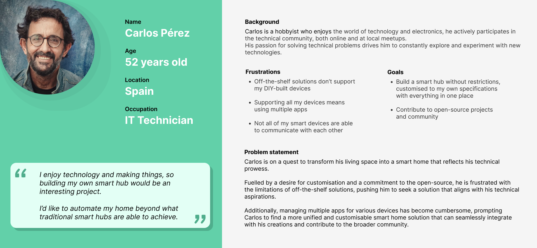
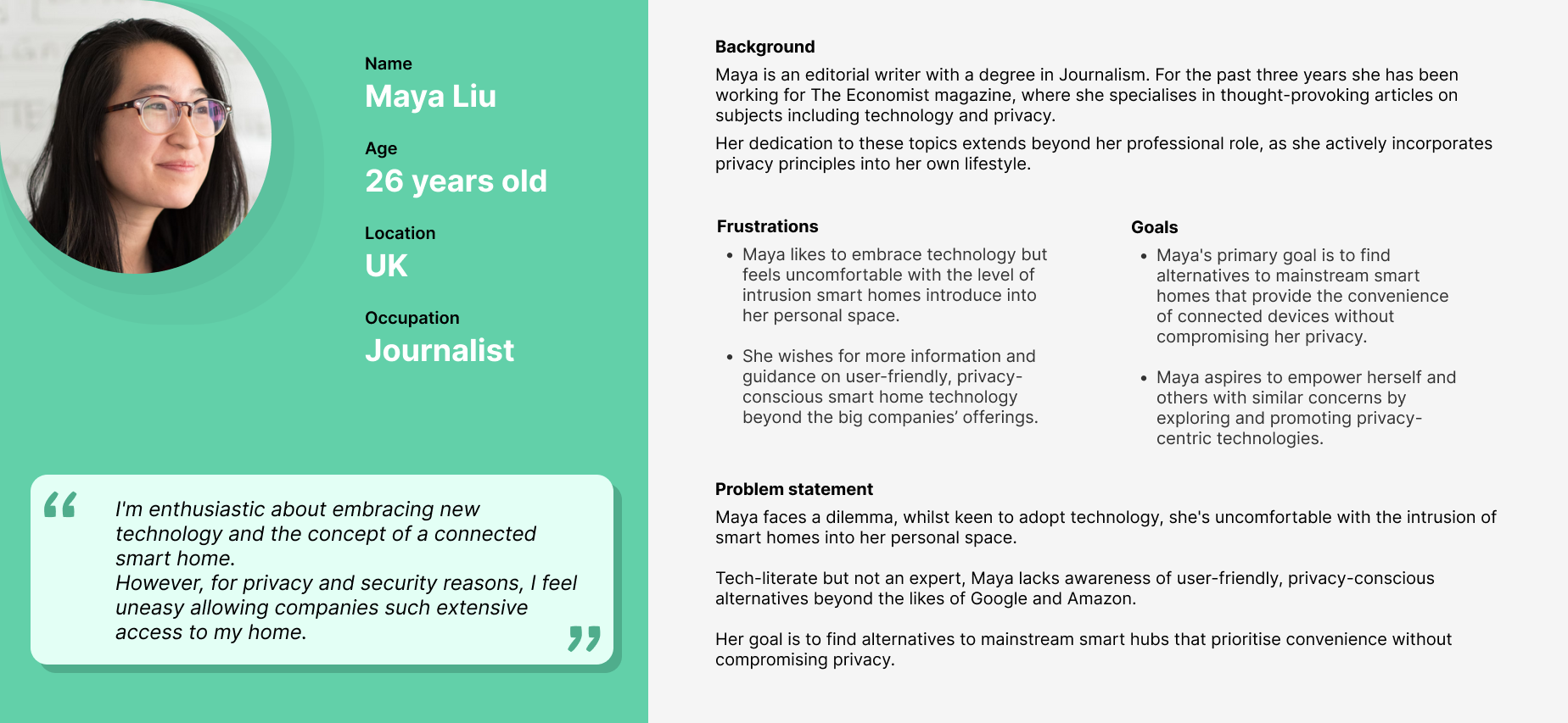
2. Personas
Using this understanding, I created two personas to help target the new design to the right audience.
3. Analysis
With a good grasp of what the platform offers and who their target audience is (or could be), I analysed the website with a more critical eye to identify areas for improvement.
This included noting what information is important for the homepage, what information isn't, and making note of product branding/styling guides. Being a 'visual thinker', I made note of these on a Miro.
Summary:
- The website currently uses an outdated and uninspiring template. The fonts, layout, and images could benefit from significant improvement to create a more engaging experience and leave a stronger first impression.
- Call to actions are good and well positioned, but far too small and not obviously clickable.
-
The hierarchy of information needs significant improvement:
- Key product features are buried at the bottom of the page instead of being prominently highlighted.
- The abundance of content creates significant cognitive overload, making the site feel unapproachable.
- Excessive use of images exacerbates confusion, making it unclear where the user should focus.
- Two column layout contributes to an overwhelming experience.
- The technical nature of the content might put some visitors off.
- It's not explained how you use/interface with the product (e.g. mobile or web apps).
- Headline, “Awaken your home” is catchy but doesn’t reveal anything about the product.
- Most of the homepage content leads to blog posts, but this is not clear. While there’s nothing technically incorrect about this approach, it comes across as a bit unconventional or unprofessional. Additionally, the links themselves lack clear context about the type of information they lead to, which can confuse users.
- Search feature only searches documentation, not the website which is unexpected.
4. Competitor Research
Snap shot of my working Miro board
To understand the competitor landscape I analysed the competition's homepages, both the indirect professional sector and direct 'DIY' competition.
- Jeedom
- Homebridge
- Gladys Assistant
- OpenHAB
- Samsung SmartThings
- Google Home
- Apple Home App
Understandably, the professional websites were considerably better designed and more engaging than the direct competition; if Home Assistant could match their quality it could easily put them above their direction competition.
On my miro board I pasted the homepages from each competitor and annotated them with the positives and negatives.
To summarise, the best examples had:
- Catchy, prominent headlines
- Clear and prioritised call to actions
- Early and clear description of what the product does
- Listed compatability with popular smart device brands, instilling confidence and suitability in the product
- Single column layout broken into clear sections, with good use of negative space
- Good use of space through carousels and paginated info boxes, reducing the cognitive load of the page
- Good contrasting colour schemes
- Good information hierarchy, how to’s and FAQ’s at the end
- Engaging and welcoming:
- SmartThings - colourful, fun, 3D cartoon renders
- Home App - welcoming dialogue
- GoogleHome - photos of people smiling to set a familiar and friendly tone
- Screenshots of the apps in it’s various forms (desktop, tablet, mobile)
- Subtle animations
- Specific examples of the kind of things it can do
- SmartThings had a video explaining the product, fun and easier to digest than reading
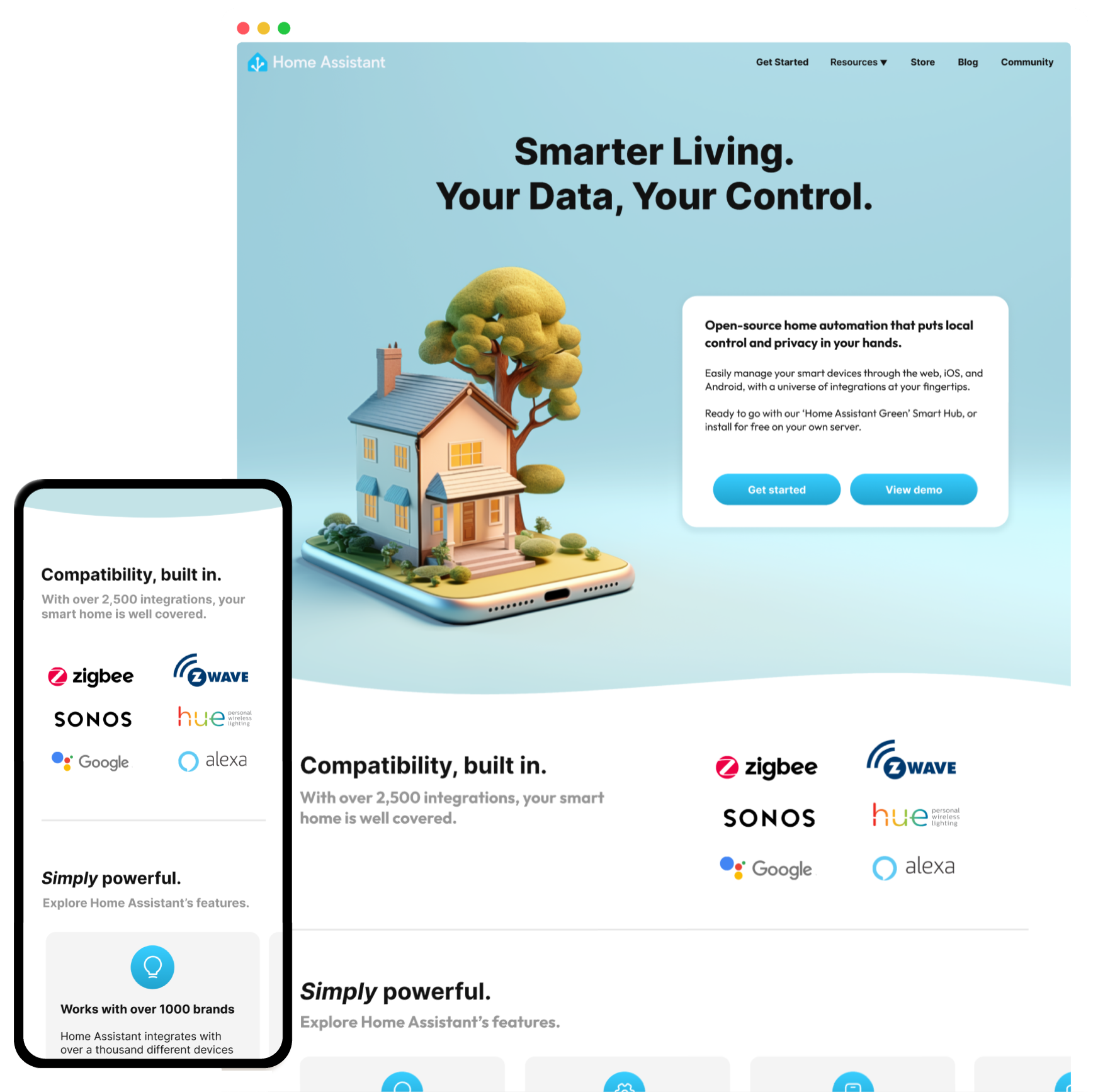
5. Design
Building on my understanding of the product and the insights gained from the competition, I began crafting my redesign, ensuring the same blue product theme was maintained and increasing the focus of the purchasable hub option.
Usually, at this point, I would break out the wireframes; however, since I knew I wanted this to be a minimalist single-column website, keeping with the tradition of most product homepages, I decided to skip this step and instead simply break down the hierarchy of the sections by priority order and got to work in Figma.
If you haven't already viewed my new design, I'd encourage you to do so here: Desktop Mobile
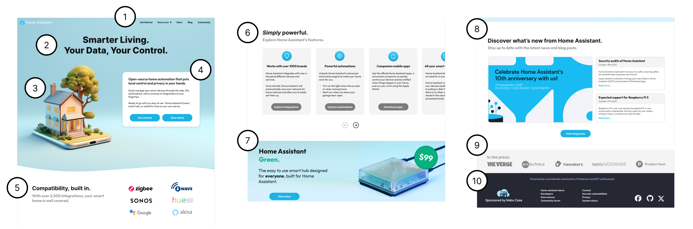
Break down of my design by section
- Condensed some of the top bar items into a single 'Resources' dropdown to avoid too many options, and added a new 'Store' option
- Catchy title to attract new users with a key selling point
- Engaging image to draw the user in and set a positive first impression (AI generated with editing)
- A clear description of its functionality and usage, with the purchase option receiving more focus and prominent call-to-action buttons
- Brief smart home compatability list to build confidence the product is relevant and supports well established services
- Features section take a more prominent stage, in a horizontal carousel to reduce cognitive load
- The purchasable smart hub gets it's own section for increased visibility and focus
- Blog posts are condensed into their own section and with lower priority so to not disengage new visitors
- In the press section for good product validation
- Footer with the usual required information in conventional format
Additional credits: Vuesax icons
Future improvements
As a short time boxed exercise, naturally there are a few improvements I would make had I given it more time:
-
Intro video
A short intro video explaining what the product does and who it is for is a powerful tool to instantly engage new visitors
-
Screenshots of the app
Screenshots of the app, especially in it's various forms (desktop, mobile) quickly validate the product is what the user is looking for
-
Price label
A minor detail, but the price label on the new design could do with a little bit more attention to make it 'pop'
-
FAQ's
Ending with a FAQ conveniently helps wrap up any common questions the user might have without them having to delve deeper into the site
-
Usability study
To validate the design has met the original objectives and is a good user experience I would conduct usability studies on the new design
🙏